What’s really behind UNSW’s top 20 QS ranking?
The latest QS World University Rankings just dropped, and guess what? My university — UNSW Sydney — has been ranked global top 20 again! Even more exciting, we’re now officially the second-highest ranked uni in Australia, just behind Melbourne and (yes!) ahead of the University of Sydney this year.
Naturally, this made the rounds on campus pretty quickly. But as someone who’s currently teaching a data science course — and always on the lookout for interesting datasets — I couldn’t resist digging into the actual numbers behind the hype.
Turns out, QS doesn’t just post pretty charts; they also make the raw data available. And if you give a data nerd a CSV… well, they’re going to analyze it.
How do QS rankings actually work?
You might assume these rankings are just about research powerhouses or who’s publishing the most. But QS uses a mix of indicators that go beyond just academic output. Here’s the breakdown:
| Lens | Weighting | Indicator | Weighting |
|---|---|---|---|
| Research and Discovery | 50% | Academic Reputation | 30% |
| Citations per Faculty | 20% | ||
| Employability and Outcomes | 20% | Employer Reputation | 15% |
| Employment Outcomes | 5% | ||
| Global Engagement | 15% | International Faculty Ratio | 5% |
| International Research Network | 5% | ||
| International Student Diversity | 0% | ||
| International Student Ratio | 5% | ||
| Learning Experience | 10% | Faculty Student Ratio | 10% |
| Sustainability | 5% | Sustainability | 5% |
So it’s not just about research. It’s also about who knows you, who hires your graduates, and how globally connected you are.
Data cleaning: focusing on the top 500
One thing I quickly noticed: universities lower down in the list often have patchy data. Missing values galore. So to keep things tidy, I focused my analysis on the top 500 universities — where the dataset is much more complete.
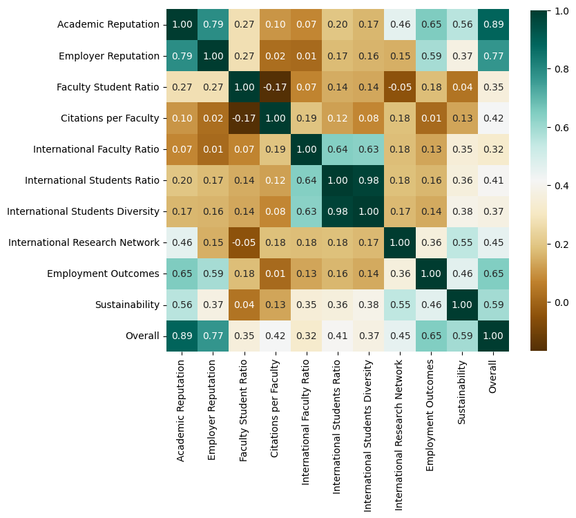
From there, I looked at how different indicators relate to each other — and a few things really stood out:
- The Overall Score is most strongly correlated with Academic Reputation, followed by Employer Reputation — which is not suprising.
- Not shockingly, Academic and Employer Reputation are tightly linked (correlation coefficient = 0.79). Prestige matters — and it clearly carries over to job prospects.
- International Students Ratio and International Students Diversity show a near-perfect correlation (0.98!), which also aligns with common expectation.

Regional trends: oceania punches above its weight

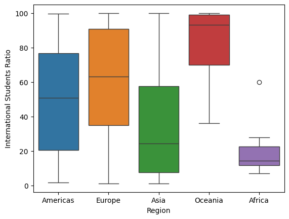
Here’s where things got fun. I started breaking down scores by region, and a few trends jumped out:
- Asian universities generally have lower international student ratios — which aligns with my own experience as a Chinese student.
- Oceania (mostly Australia and New Zealand) stands out with massively high international student ratios — over 90% on average! That’s higher than both Europe and the Americas.
A fun little outlier: the University of Johannesburg in South Africa has a whopping 60.1% international students — far higher than any other university on the continent.
This focus on international engagement might help explain why Australian universities tend to do so well in global rankings. I mean… UNSW beat Yale this year. I still can’t quite believe that.
But it’s not all good news.

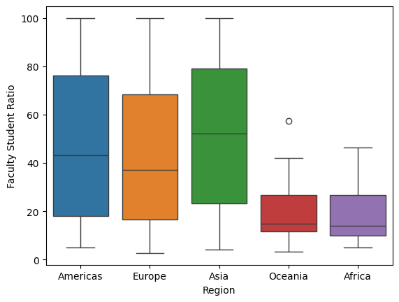
One metric where Oceania really lags? Faculty/Student Ratio — a rough proxy for class size and teaching support. Along with African universities, Oceania scores the lowest in this category.
(That single outlier with excellent faculty/student support in our region? Massey University, New Zealand.)
This might reflect funding models, growing enrolments, or how universities allocate teaching staff — but it’s a reminder that no university system is perfect.
So what really drives QS rankings?
From this little data dive, it’s pretty clear that Academic Reputation is still the heavyweight in the QS formula — but global engagement plays a huge supporting role.
And that favors universities like UNSW, which have built strong international strategies over the past few decades. On the flip side, even a well-known institution might struggle if class sizes balloon or their teaching support drops.
Final thoughts
As a proud UNSW alum and a slightly obsessive data nerd, I’ve always been curious about what’s behind the numbers we love to celebrate. We talk a lot about rankings, but rarely about what they mean.
Looking at the data this way gives me a clearer sense of what makes UNSW strong — and where we could still improve.
So next time someone throws out a ranking in conversation, maybe ask:
“Cool — but what’s actually behind that number?”
Enjoy Reading This Article?
Here are some more articles you might like to read next: