Seaborn.objects interface cheatsheet
Seaborn has long been a favorite among Python users for creating stunning visualizations. With the release of Seaborn 0.12.0 in September 2022, the library introduced a new objects interface that brings unparalleled flexibility and customization to plotting. While the official documentation is thorough, this blog serves as a practical cheatsheet, highlighting my experience using the interface to craft publication-quality figures.
If you’re new to Seaborn or transitioning from its classic API, this guide will help you confidently create beautiful, professional-grade plots.

How does it work?
At the core of Seaborn’s objects interface is the so.Plot object. As Seaborn’s creator described, the Plot function forms the foundation of the interface, supported by four key components:
-
Mark: Defines how data points are represented (e.g., dots, bars).
-
Stat: Applies statistical transformations to the data.
-
Scale: Adjusts visual aspects like color and size.
-
Move: Modifies positional elements, such as jittering points.
Although the extensive options may seem daunting initially, the interface is designed to follow a clear hierarchy.
# Basic Structure of a Seaborn Objects Plot
so.Plot(data, x, y, ...).add(Mark, *Stat, *Move, ...)
Here’s a breakdown:
so.Plot: Creates the base plot object. Parameters like data, x, y, and color can be set globally or for individual layers.
.add: Adds layers with specific visual elements (e.g., dots) and transformations (e.g., statistical summaries).
Examples in Action
import seaborn.objects as so
from seaborn import axes_style

(
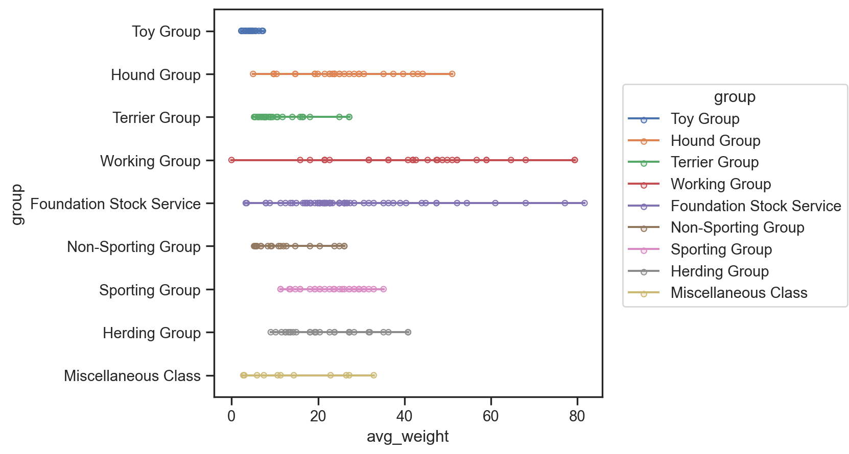
    so.Plot(data=dogs, x="avg_weight", y="group", color="group")
    .add(so.Dots())  # Layer 1: Add dots for each group
    .add(so.Range())  # Layer 2: Add range for variability
    .theme(axes_style("ticks"))  # Set a clean theme
)

(
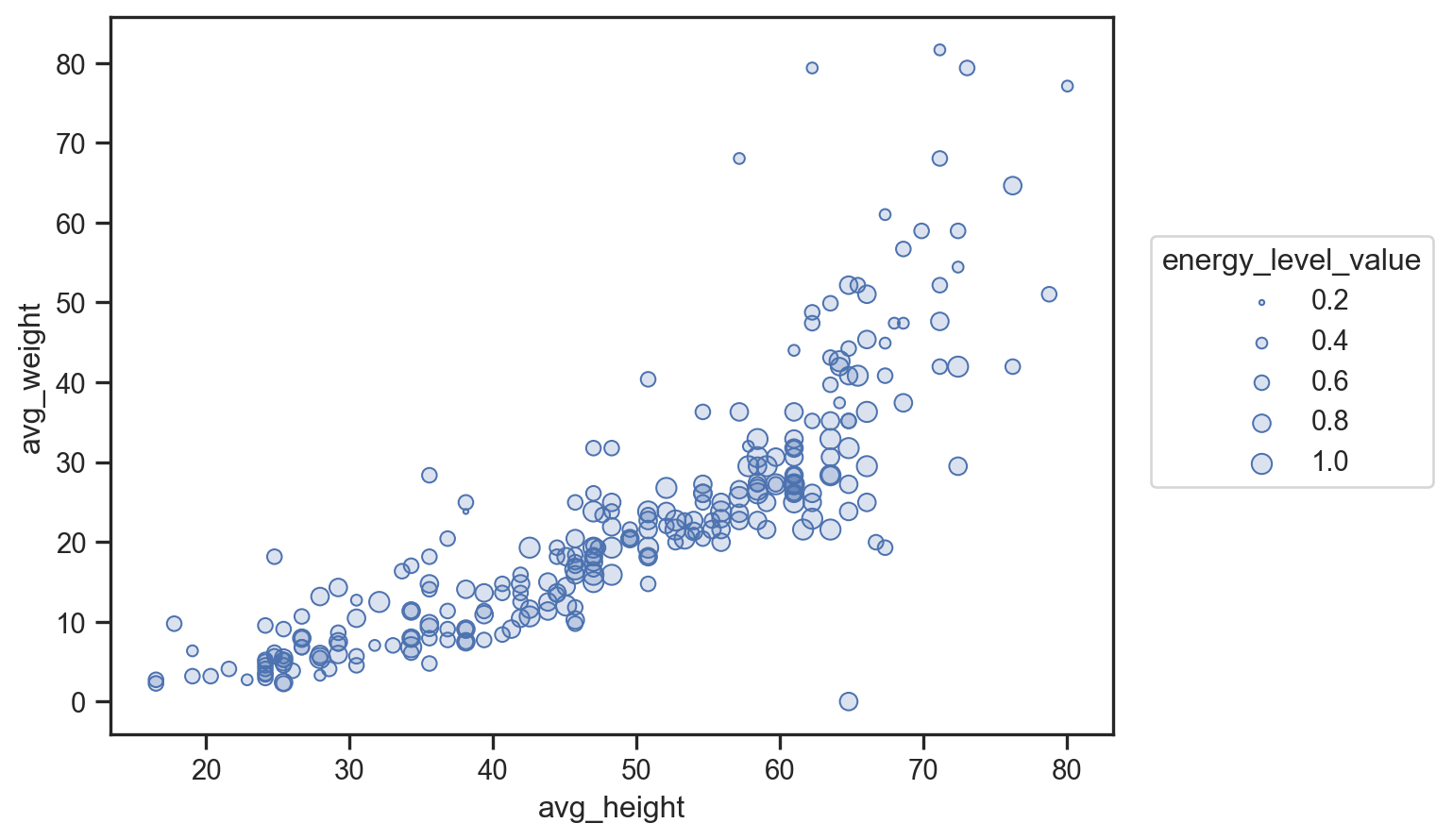
    so.Plot(data=dogs, x="avg_height", y="avg_weight", pointsize="energy_level_value")
    .add(so.Dots())
    .theme(axes_style("ticks"))
)

Advanced Options
For more complex layouts, you can use facet or pair plots to create subplots.
Faceting by Category
(
    so.Plot(data=dogs, x="avg_weight", y="avg_height")
    .facet(col="breed")
    .add(so.Dots())
)
Pair Plot Across Variables
(
    so.Plot(data=dogs)
    .pair(x=["labrador", "golden_retriever"], cross=True)
    .add(so.Dots())
)
Customizing Appearance
Seaborn’s objects interface allows fine-tuned control over plot aesthetics.
plot = (
    so.Plot(data=dogs, x="avg_weight", y="avg_height")
    .scale(color={"value": "black"}, marker={True: "o", False: "x"})
    .layout(size=(7, 5))
    .limit(x=(0, 1), y=(0, None))
    .label(x="Weight (kg)", y="Height (cm)", title="Dog Statistics")
    .theme(axes_style("ticks"))
)
plot.save("path-to-figure.svg")
Integration with Matplotlib
Seaborn plots can be seamlessly integrated into Matplotlib figures for additional customization.
import matplotlib.pyplot as plt

fig, ax = plt.subplots(figsize=(7, 5))
plot.on(ax).plot()
ax.set_xticks([])
ax.set_yticks([])
ax.set_aspect(1.0 / ax.get_data_ratio(), adjustable="box")

fig.savefig("path-to-figure.svg")
Final Thoughts
Seaborn’s objects interface empowers users to create detailed, publication-ready plots with ease. From basic designs to advanced layouts and Matplotlib integration, this cheatsheet provides a comprehensive guide to mastering the interface.
For more tips on color palettes, marker styles, and additional customizations, stay tuned for my next blog post!
Enjoy Reading This Article?
Here are some more articles you might like to read next: