Colour choices in scientific plots
If you’ve ever spent hours fiddling with colour palettes in your figures (only to end up frustrated), you’re not alone. We often see gorgeous figures in journals like Nature or Science, but getting your own colour scheme to look equally polished can feel like an impossible task.
The truth is, with colour choices practically limitless these days, it’s really easy to go overboard. The result? Overly busy figures that confuse your readers more than they help them. Today, I want to take you on a quick tour of colour theory and show you how to use it in your scientific plots—without driving yourself (or your audience) up the wall. While I mainly use Seaborn for my visualizations, the same ideas apply no matter which plotting tool you prefer. I’ve also put together a handy cheatsheet of commonly used palettes (with real data examples) if you need some inspiration or just want to pick your colours quickly.

A Quick Colour Theory Refresher
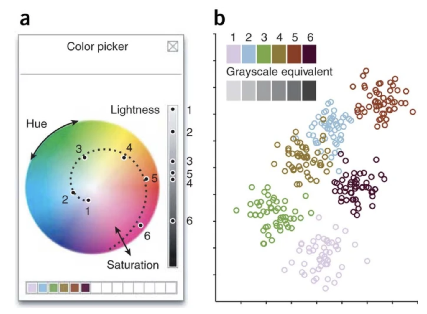
Even if you’re not a design guru, you’ve probably heard of the RGB system—red, green, and blue—the primary colours on your computer screen. But the way we perceive colour is actually a bit different. We tend to notice three main components:
- Hue: The name of the colour itself (red, green, blue, etc.).
-
Saturation: How vibrant or “washed out” the colour appears. Think of it as bold vs. greyed-out.
- Lightness: How bright or dark a colour is, from black to white.
This concept is well explained by this excellent illustration from Nature Methods post.

Keeping these in mind can make a world of difference. Adjusting hue, saturation, and lightness thoughtfully ensures your plot conveys exactly what you want it to—especially for categorical versus continuous data.
Qualitative Colour Palettes (For Categorical Data)
When you have distinct categories (e.g., different experimental groups or species), you want each category to stand out. These palettes primarily vary in hue, with slight adjustments in saturation and lightness for better aesthetics. That usually means picking colours that are separated on the colour wheel—like blue and orange (opposite each other).
Most off-the-shelf palettes, like Tableau, Seaborn, or ColorBrewer, come with around ten colours. For many projects, that’s plenty. My personal favourite is Seaborn’s default palette, called deep (see figure below), which looks professional and generally offers enough contrast to separate categories. If you have trouble distinguishing some of the hues, or if you’re concerned about colour blindness, Seaborn’s colorblind palette is a great alternative.

But what if you have more than 10 categories? That’s when something like husl in seaborn (see figure below) can save the day by evenly slicing the hue circle into as many colours as you need.

Sequential Colour Palettes (For Continuous Data)
If your data run from low to high (like concentrations, counts, or intensities), a sequential colour palette is your friend. These palettes mostly vary by lightness, sometimes with subtle hue changes to help our eyes pick up on small differences.
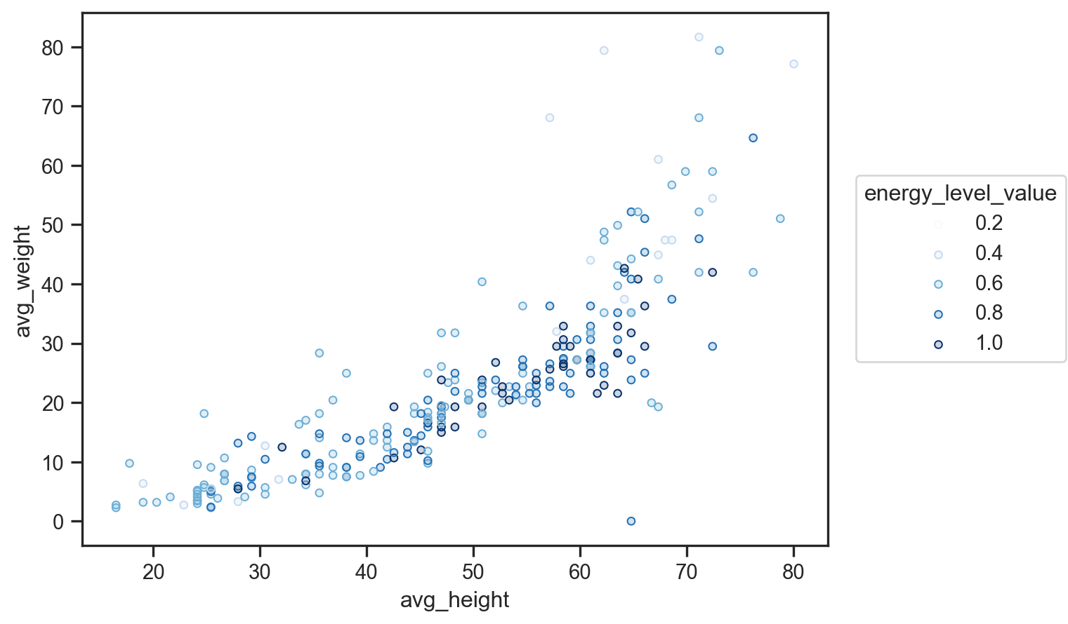
A common example is ColorBrewer’s Blues palette, which moves from a pale, almost-white blue to a deep navy. This type of palette is my usual go-to for continuous data, but it comes with a couple of potential pitfalls (see figure below). First, the darkest shade tends to draw the most attention, which can be misleading if those values aren’t actually the most significant. Second, very light shades may blend into a white background, making it hard to distinguish lower values.

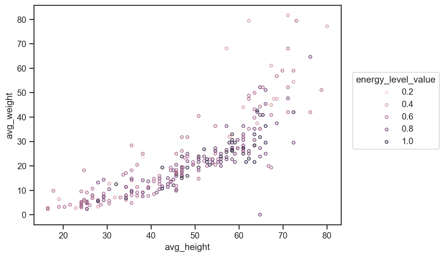
To avoid these issues, you might try a “perceptually uniform” palette, which adds in a bit of hue variation so you don’t have to rely purely on lightness changes. One well-known option is viridis, though I’ve found that it doesn’t always complement my data visually. Instead, I often use Seaborn’s default ch:s=-.2,r=.6 palette (see figure below), which is a happy medium between a standard sequential scheme and a fully perceptually uniform approach.If you prefer slightly less variation in lightness, flare and crest are also excellent options.

Diverging Colour Palettes (For Values Above and Below a Midpoint)
Diverging palettes essentially combine two sequential colour ramps around a middle value, which can be really handy if you’ve got data centered on a crucial midpoint (like zero, with both negative and positive values).
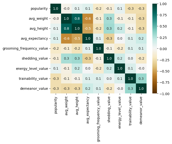
In scientific plotting, one of the most common use cases for a diverging palette is a correlation heatmap, where values can range from -1 to 1. Strong correlations (either positive or negative) will appear bold at either end of the colour scale, while near-zero correlations fade into the middle.
My personal go-to for this scenario is the BrBG palette (brown to blue-green). It feels natural and provides good contrast for highlighting strong negative and strong positive values.

Final Thoughts
Choosing colours for scientific plots is as much an art as it is a science. Even after learning so much about colour theory, I still find myself relying on Seaborn’s well-designed default palettes in most of my research papers—they just work.
If you’re interested in a deeper dive into colour selection, I highly recommend these excellent posts by Seaborn and Matplotlib on using colour effectively in data visualization. For a broader discussion on scientific plotting, Nature Methods published a fantastic Points of View series in 2013, written by Bang Wong and co-authors, covering key principles of data visualization.
Happy plotting!
Enjoy Reading This Article?
Here are some more articles you might like to read next: